Tonal Dressing in Late October: Why One-Color Days Give Your Eyes and Mood a Rest
By Starener Editorial - 13/09/2026 - 0 comments
Scroll long enough and your eyes know the feeling: a low, static hum of too many colors. Billboards, feeds, packaging, notifications — the modern visual diet is loud in a way we rarely name. Against that backdrop, one of the quietest trends in style is having a moment for reasons that go deeper than aesthetics: the head-to-toe, single-color outfit. Tonal dressing — building a look from one color family — turns out to be less a fashion statement than a sensory intervention.
What Tonal Dressing Actually Is
Tonal dressing is not wearing one flat color from collar to shoe. It is composing an outfit from one hue at several values: a deep forest-green knit over sage trousers with a pale mint tee underneath. Stylists describe the palette in three moves — tints (the hue mixed with white), tones (mixed with grey), and shades (mixed with black). The layering of those values creates depth without ever introducing a second color.
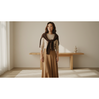
And when color variation disappears, something else steps forward: texture. A matte wool coat against a satin scarf in the same camel family, ribbed knit beside smooth leather — texture becomes the interest, replacing the contrast that color would normally supply.
Why One-Color Days Feel Calmer
The mechanism sits at the first layer of the color energy system: guiding visual focus. The human eye is drawn to edges and boundaries. A multi-colored outfit draws hard lines everywhere — at every seam, every contrast. A low-contrast tonal outfit blurs those boundaries so the eye reads the whole silhouette as a single unified shape. There is simply less to parse.
Fashion psychologists describe the effect as reduced cognitive load: the brain spends fewer resources processing color variation, and many people report the difference as a felt sense of composure rather than something they consciously notice. Low-contrast tonal looks are also famously elongating — the unbroken vertical line of a single hue reads as taller, leaner, quieter.
The mood dimension
The second and third layers — bodily sensation and cultural memory — are where tonal dressing becomes personal. A cream-on-oatmeal ensemble carries a different bodily temperature than charcoal-on-black, even though both are "neutral." Practitioners of color-energy work suggest choosing the family deliberately:
- Warm neutrals (camel, oatmeal, rust) — grounded warmth, approachable, autumn-coded.
- Cool neutrals (grey, slate, navy) — composed authority, visual silence.
- Deep greens — steady, restorative, quietly confident.
- Full monochrome black — focus and boundary; the classic "do not disturb" of palettes.
Building a Low-Contrast Look: The Three-Value Rule
The most common failure of monochrome dressing is flatness — the outfit reads as one note. The fix is a simple rule of thumb:
- Pick one hue family that suits both the day's mood and your undertone.
- Use three values of it — one light, one mid, one deep. The gradient creates dimension.
- Vary every texture — matte against sheen, rough against smooth. If two adjacent pieces share both color and texture, the outfit collapses.
- Keep accents within the family — or let one metallic or stone accent do the breaking.
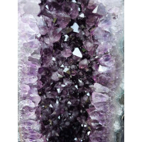
That last point is where jewelry earns its keep. A single piece of crystal jewelry in a complementary tone — rose quartz against charcoal, amber-toned stone over forest green — becomes the outfit's one deliberate interruption. The color-matched crystal pieces at Starener are built for exactly this role: one small accent that gives the tonal field a focal point without reopening the color noise.
A Week of One-Color Experiments
Because color energy work treats dressing as a feedback loop, the recommendation is to test rather than believe. For seven days, wear one tonal family per day and keep a three-line journal: the family, the day's energy, and one word for how the outfit felt by evening. Most people discover a pattern quickly — which family steadies focus-heavy days, which one softens social ones, and which they reach for instinctively when reserves are low.
Treat the low-contrast days as rest days for the visual system — the chromatic equivalent of a quiet room. High-contrast days will still have their place; the point is that you are now choosing, rather than defaulting into whatever the closet threw at you.
Frequently Asked Questions
Does tonal dressing only work with neutrals?
No — any hue works. Greens, blues, rusts, and even pinks all support tonal layering. The principle is value variation within one family, not the specific color chosen.
Will a single-color outfit look boring?
Flatness comes from a single value and a single texture. Three values plus varied fabrics reads as intentional and dimensional — observers perceive cohesion, not sameness.
Which tonal palette suits low-energy days?
Many people find warm mid-value neutrals — oatmeal, camel, soft brown — feel steadying without the visual weight of black. The seven-day journal is the honest way to find your own answer.
How does this connect to color energy practice?
Tonal dressing works primarily on the visual-focus layer of the color energy system: fewer boundaries to process means less ambient stimulation, which many people experience as a calmer baseline mood across the day.
Tags: tonal dressing, monochrome outfit, color energy, visual rest, style psychology
Related Pieces
View All →

This content is copyrighted by its original authors. In case of any infringement, please contact us for removal.
Comments
Write a comment