The Desk Color Map: How Color Energy Guides Visual Focus in Your October Workspace
By Starener Editorial - 23/08/2026 - 0 comments
If your desk has ever felt "off" for reasons you cannot quite name, colour is often the quiet culprit. In the three-layer model of color energy, colour shapes experience by guiding visual focus, triggering bodily sensory associations, and awakening personal and cultural memory. A workspace is the perfect place to see all three layers at work — you look at your desk for hours every day, and October's shrinking daylight makes the palette matter even more.
Layer one: the neutral base field
The base layer is what your eyes rest on most: desk surface, monitor, mat, storage. Keep it neutral — light wood, warm white, cream, warm grey or deep charcoal — and low on pattern. The logic is visual focus itself: a calm field reduces visual noise, so the accents that remain actually register. Many people find that simply clearing a cluttered, multi-coloured desk surface changes how quickly they settle into work, before adding any new colour at all.
Layer two: the focus colours — blue and green
Blue is the classic concentration hue. Practitioners of colour psychology associate it with clarity and steady attention, and some workplace tests have found tasks completed faster in blue-tinted environments. You do not need to paint anything: a navy notebook, a blue desk mat or a single blue pen reserved for deep work is enough to build the association.
Green does different work. Linked with nature and restoration, it is gentle on eyes that spend the day on screens and supports longer, calmer sessions. Sage, seafoam or a small living plant on the desk bring the same quality — and a plant adds the bodily, sensory layer that plain objects cannot. Where blue sharpens the start of a task, green is what keeps you in the chair an hour later; the two are complements, not competitors, and a desk that carries both tends to feel finished.
Layer three: accents in small doses
Yellow is the alertness accent — energising in a sticky note, a mug or a pen cap, overwhelming as a wall. Red is a signal, not a palette: use it only to mark what is urgent, and let its rarity keep the signal strong. Warm amber tones belong to the evening; if you work after dark, shifting your desk lamp toward warm light works with your body's natural wind-down rather than against it.
Common desk color mistakes
The most frequent one is treating the desk as a showcase rather than a tool. Souvenirs, packaging and novelty gadgets each carry their own colour and pull the eye; five competing focal points means none of them works. The second mistake is going all-in on one hue — an entirely blue office can tip from calm to cold, and an entirely warm one drifts from cosy to restless. Contrast is what makes each colour legible. The third is ignoring light temperature: a cool palette under warm evening bulbs reads muddy, while the same palette under daylight-balanced light reads crisp. Match your bulb to your palette, or your palette to your bulb, and stop fighting the fixture.
A seven-day desk palette experiment
Test rather than trust, because personal and cultural memory makes colour responses individual. For one week:
- Set a base field: one neutral surface, cleared of clutter.
- Add one blue anchor for deep work and one green element for endurance.
- Allow a maximum of two small yellow or warm accents.
- Each evening, note one line: did settling in feel faster or slower than yesterday?
Most people notice the change in how quickly they start, not in dramatic output jumps. That is the sensory layer doing its work — the desk becoming a cue that says "this is where focus happens."
If you want to carry the same logic off the desk, colour-coded gemstone jewellery works the same way against your skin: a blue or green stone worn during deep work acts as a wearable version of the palette. The colour energy pieces at Starener are organised by exactly these correspondences.
FAQ
Do I need to repaint my office?
No. Accessories — mats, notebooks, lampshades, plants — deliver most of the effect at a fraction of the effort. Test small and temporary changes before committing to anything permanent.
Which color is best for creativity?
Soft yellow is traditionally linked with idea generation, used in small accents. Pair it with neutral tones so it stimulates without dominating your visual field.
Why do color effects differ from person to person?
The third layer of color energy is memory: personal history and culture attach different meanings to the same hue. A colour you associate with a stressful classroom will never work for you the way the guidebooks promise.
How long should I test a palette?
Give it at least seven working days before judging. Natural light shifts through the day and through the season, and October light is different from summer's.
Tags: desk color psychology, color energy, workspace palette, focus colors
Related Pieces
View All →
You May Also Like
All Articles →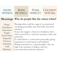

This content is copyrighted by its original authors. In case of any infringement, please contact us for removal.
Comments
Write a comment