Brown Is Orange With the Lights Turned Down: A Mocha-Season Colour Guide (November 2026)
By Starener Editorial - 31/10/2026 - 0 comments
A Colour Nobody Puts First
Ask people to name a favourite colour and brown rarely appears. Ask them what they instinctively reach for in November, and brown appears constantly. The gap is not hypocrisy. Brown is a colour people wear rather than admire, which makes it unusually good material for studying how colour energy actually works: not as a statement, but as a background condition that changes how everything else feels.
What Brown Actually Is
Brown is not on the spectrum in the way red or blue is. In pigment terms it is usually described as a mixture of red, yellow and black; in light terms it is a dark, low-chroma orange. Turn the lights down on orange and you get brown. This is not a technicality, it explains the entire emotional range: brown keeps orange's warmth but removes its urgency. The energy is still there, it has simply stopped waving at you.
That single fact resolves a common confusion. People describe brown as both cosy and heavy, both comforting and dull. Those are the same property experienced at different doses. Warmth without brightness soothes in a jumper and deadens in a large flat wall with no variation.
Why It Calms: Two Mechanisms
Colour psychology usually separates two things that get blurred together. The first is association: what a colour reliably reminds you of. Brown carries an unusually consistent set of associations across cultures, because the referents are physical, soil, bark, stone, leather, coffee, bread, fur. The second is preference: whether you personally like the thing it reminds you of. This is where individual history enters, and why someone raised near red earth can find brown nourishing while someone else finds it stifling.
Practitioners of colour work tend to add a third layer, borrowed from the chakra vocabulary, where brown is read as a grounding tone associated with the lower body and the sense of being supported. Whether you take that literally or symbolically, the practical effect is the same: brown reduces the amount of visual decision-making a room or an outfit demands.
Three Registers, Not One Colour
Treating brown as a single colour is why so many people think they cannot wear it. It is at least three different tools.
- Beige. The lightest register, close to white but softer and warmer. It reads as permission to slow down, and it is forgiving in a way pure white is not. In November it functions as light without glare.
- Camel and khaki. Mid-tone, slightly greyed, structurally neutral. This is the register of coats and tailoring, and it carries a quiet authority because it does not compete with anything. It is also the most universally wearable of the three.
- Mocha, chocolate, espresso. The saturated end. These are the colours that make an outfit feel finished, and the ones most likely to overwhelm a face if the undertone is wrong. Worn near the skin, they demand a little more attention than camel does.
The 2025 arrival of a mocha shade as a major colour-of-the-year announcement did something useful for the category: it moved brown from "safe alternative" to "deliberate choice". The fashion cycle around earthy dressing has continued into the 2026 season, which is why the palette currently looks less like a trend and more like a default.
The Face Test
Brown near the face is where the colour either works or quietly drains you, and the deciding factor is contrast rather than taste. If your skin has a cool or very fair cast, a deep chocolate worn at the throat can pull colour out of the face; a lighter camel or a beige with a pink undertone usually reads better. If your colouring is deeper or warmer, the saturated end tends to look natural and the pale end can look washed out.
The test takes one minute. In daylight, hold two brown items, one light and one deep, under your chin and look at your jawline rather than the fabric. The right one makes the edge of your face look defined. The wrong one makes it look slightly grey. Trust the jaw, not the mirror's opinion of the garment.
Texture Does the Work
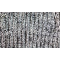
Because brown has low chroma, it cannot rely on hue to create interest. This is why brown outfits either look expensive or look like a cardboard box, with very little in between, and the difference is almost always texture. Suede against knit, leather against wool, a matte stone against a polished metal. Two browns in different materials read as a considered palette. Two browns in the same flat fabric read as a uniform.
Jewellery is the fastest way to add that variation. A warm metal, a wood bead, a smoky quartz or a tiger's eye pendant introduces a different surface to the same colour family without adding a new hue. Starener's earth-toned crystal pieces sit naturally in this register.
Proportion and One Light Source
Brown responds badly to being spread evenly. The familiar proportion works well here: roughly sixty per cent of the outfit or room in a base brown or beige, thirty per cent in a mid-tone, and ten per cent in something that catches light, a cream, a warm metal, a single pale stone. Without that ten per cent, the whole thing goes flat by late afternoon.
Light matters as much as proportion. Brown changes character under warm indoor lighting, becoming richer and redder, and turns greyish under cold daylight. A colour you chose in a shop at 3pm may look entirely different at 8pm in your own kitchen. Check it once in each condition before you commit.
A Three-Day Brown Experiment
If you want to know what brown does for your own energy rather than the general population, run a short test rather than reading more about it.
- Day one. Wear your lightest brown or beige and note two things at the end of the day: how many decisions you made about your appearance, and how visible you felt.
- Day two. Wear the deepest brown you own, with a cream or metal accent near the face. Note the same two things.
- Day three. Wear your usual colour and compare. The difference between day three and the other two is your actual result, not the average.
Most people find that brown reduces the sense of being looked at, which is either a relief or a disappointment depending on the week they are having. Both answers are useful. Colour energy is not a fixed doctrine; it is a set of tendencies you can check against your own life.
FAQ
Is brown really a colour if it is not on the spectrum?
In everyday use, yes. Physically it is a dark, low-saturation orange, which is why it behaves like a muted warm colour rather than a separate family. That description also explains why brown feels warm but not stimulating.
Why does brown look dull on some people?
Usually contrast rather than colour. A brown that is too close to your skin's depth, or too cool for your undertone, removes definition from the face. Changing the shade by one or two steps often fixes it entirely.
Can brown be worn in summer?
Yes, in its lighter registers and lighter fabrics. The association with autumn is cultural and strong, but linen in sand or ecru reads as warm neutral rather than as a seasonal mismatch.
What accent colour works best with brown?
Cream, off-white and warm metals are the safest, because they add light without introducing a competing hue. A single cool accent, such as a soft blue, works too, but it changes the mood from calm to contrast.
Tags: brown colour energy, earth tones, mocha palette, colour psychology
Related Pieces
View All →
You May Also Like
All Articles →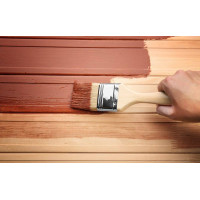

This content is copyrighted by its original authors. In case of any infringement, please contact us for removal.
Comments
Write a comment